Last week I wanted to start with a kaggle competition about US Census Data, but I’ve struggled with the visualization of the data set. There are 3132795 people listed in this census and so every plot that I knew yet looked like a black mass of dots, without anything interesting to see. A little bit frustrated I searched for methods to plot with too many points and found some pretty solutions in a stackoverflow answer, but my computer crashed down by every plot they suggested. At this point I was asking myself how it should be possible to plot such big data sets without buying a new super computer? And then, as everytime working with R, I found the answer via Hadley Wickham (who had thought it?) and his bigvis package. The idea behind bigvis is:
The aim is to have most operations take less than 5 seconds on commodity hardware, even for 100,000,000 data points. ~Hadley Wickham on hadley/bigvis
For a better understanding of bigvis look at a paper from Hadley Wickham about bigvis. Bigvis uses various steps of binning, summarising and smoothing on the data set and after that you can visualize it. The first step is to bin the data set, which means that you cut it in sections which will decreases your data set and bigvis counts the observations which fall into this section. After that there you could smooth the data, which means that noizy data will be controlled. For my purpose I will just use the binning.
So in the following I will visualize the plots from stackoverflow (except the ggsubplots, because there are some problems with this package) using the census data from kaggle with the help of bigvis!
##Getting the data To get the data, download it here. There are two data sets, that must be combined to one and I won’t read every variable into R by using the fread command:
#### to read the data into R use this code:
# variables <- c("ST","AGEP","COW","MAR","WKHP","WKW","FOD1P","PERNP")
#
# census.data.a <- fread("/home/matti/Downloads/USCensusData/pums/ss13pusa.csv",select = variables)
#
#
# census.data.b <- fread("/home/matti/Downloads/USCensusData/pums/ss13pusb.csv",select=variables)
#
# census.data <- rbind(census.data.b,census.data.a)
#
# rm(census.data.b,census.data.a)
#
# setwd("~/Arbeitsfläche")
# save(census.data,file = "censusdata.RData")

##I just saved it
setwd("~/Arbeitsfläche")
load("censusdata.RData" )
##Packages
library(ggplot2)
# install.packages("devtools")
# devtools::install_github("hadley/bigvis")
library(bigvis)
library(hexbin)
##Checking the data
str(census.data)
## Classes 'data.table' and 'data.frame':	3132795 obs. of  8 variables:
##  $ ST   : int  29 29 29 29 29 29 29 29 29 29 ...
##  $ AGEP : int  21 22 21 58 52 46 39 15 9 85 ...
##  $ COW  : int  1 1 NA 1 6 1 3 NA NA NA ...
##  $ MAR  : int  5 5 5 1 1 1 1 5 5 2 ...
##  $ WKHP : int  40 20 NA NA 50 40 45 NA NA NA ...
##  $ WKW  : int  1 1 NA NA 1 1 1 NA NA NA ...
##  $ FOD1P: int  NA NA NA 6203 6203 6203 2300 NA NA NA ...
##  $ PERNP: int  20400 16700 0 0 60000 65000 54000 NA NA 0 ...
##  - attr(*, ".internal.selfref")=<externalptr>
head(census.data)
##   ST AGEP COW MAR WKHP WKW FOD1P PERNP
## 1 29   21   1   5   40   1    NA 20400
## 2 29   22   1   5   20   1    NA 16700
## 3 29   21  NA   5   NA  NA    NA     0
## 4 29   58   1   1   NA  NA  6203     0
## 5 29   52   6   1   50   1  6203 60000
## 6 29   46   1   1   40   1  6203 65000
sum(is.na(census.data))
## [1] 7413178
##Percent of NA
sum(is.na(census.data))/(nrow(census.data)*ncol(census.data))*100
## [1] 29.57893
##Using bigvis: binning the data
After all there are definitely some interesting relationships between some variables, but I’m interested in the relationship between the usual hours worked per week in the last 12 months (WKHP) and the total person’s earning (PERNP).
That is why I will just use bigvis on this two variables. By doing that I have to think about how the data should be divided. For the person’s earning I think a cutoff of 1000 and for hours per week 5 hours can be useful.
binned <- with(census.data,condense(bin(PERNP,1000),bin(WKHP,5)))

##let's take a look at the new data frame
str(binned)
## Classes 'condensed' and 'data.frame':	6537 obs. of  3 variables:
##  $ PERNP :Classes 'dgrid', 'numeric'  atomic [1:6537] NA -8500 -8500 -8500 -8500 ...
##   .. ..- attr(*, "width")= num 1000
##   .. ..- attr(*, "origin")= num -9000
##   .. ..- attr(*, "nbins")= int 1030
##  $ WKHP  :Classes 'dgrid', 'numeric'  atomic [1:6537] NA 2 7 12 17 22 27 32 37 42 ...
##   .. ..- attr(*, "width")= num 5
##   .. ..- attr(*, "origin")= num -0.5
##   .. ..- attr(*, "nbins")= int 21
##  $ .count: num  591276 2 3 3 2 ...
##can we compare the old and the new summary of the data
summary(census.data$WKHP)
##    Min. 1st Qu.  Median    Mean 3rd Qu.    Max.    NA's
##     1.0    32.0    40.0    37.9    42.0    99.0 1541931
summary(binned$WKHP)
##    Min. 1st Qu.  Median    Mean 3rd Qu.    Max.    NA's
##    2.00   32.00   52.00   51.27   67.00   97.00       2
summary(census.data$PERNP)
##    Min. 1st Qu.  Median    Mean 3rd Qu.    Max.    NA's
##   -9000       0   10000   27860   40000 1019000  591276
summary(binned$PERNP)
##    Min. 1st Qu.  Median    Mean 3rd Qu.    Max.    NA's
##   -8500   74500  171500  215100  327500 1019000       1
##Hexagonal binning After all we can start to plot the data:
hours.earning <- ggplot(binned ,aes(x=WKHP,y=PERNP))

hours.earning + stat_binhex()+geom_abline(x=0)
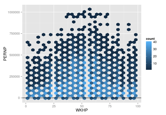
Recognize that there are some people under the y-axis, with a negative earning, but with many hours they worked.
##Ggplot2 with alpha
hours.earning + stat_bin() + geom_jitter(alpha=0.3)
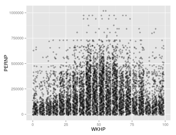
##Contour lines
hours.earning + geom_point() + geom_density2d()
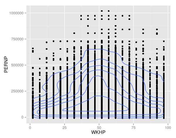
##Combining density contours with alpha blending
hours.earning+
  geom_point(colour="blue", alpha=0.2) +
  geom_density2d(colour="black")
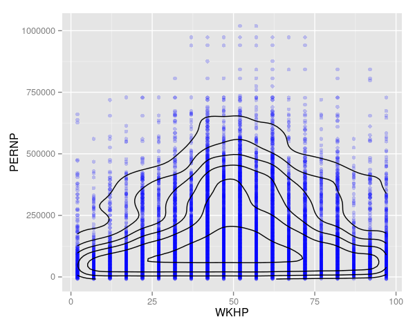
##Base Graphics
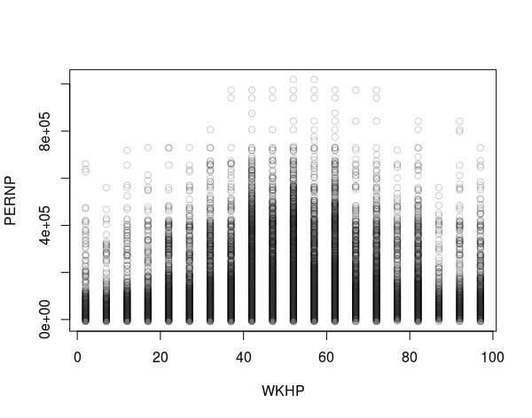
with(binned, plot(x=WKHP, y=PERNP, col="#00000033"))
##Using smoothscater
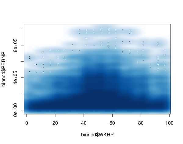
smoothScatter(y=binned$PERNP,x = binned$WKHP)
##Hexbinplot
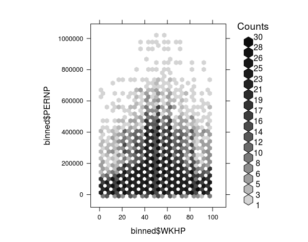
hexbinplot(binned$PERNP ~ binned$WKHP)
##Autoplot from bigvis
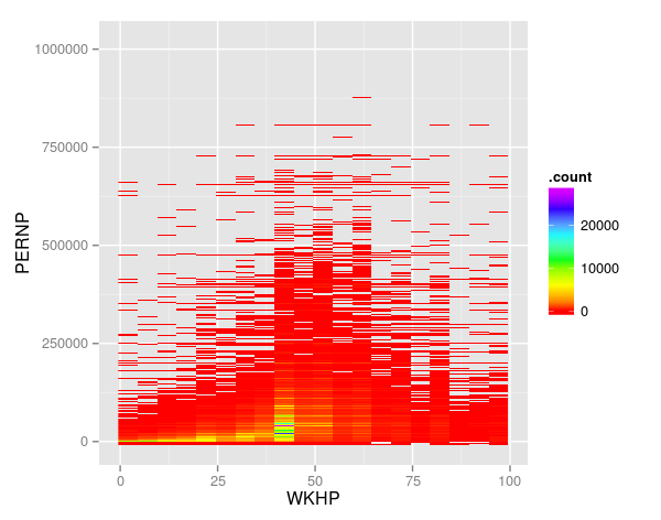
autoplot(binned)+coord_flip()+scale_fill_gradientn( colours = rainbow(6))
##In a nuthsell It is difficult to viusualize big data sets because of the power of your computer and the plots can be unreadable. Bigvis is a good solution to this problem and I want to get more information about the other commands and possibilities of the bigvis package.