Hi this is a R markdown document, to show you some of the basics to develop graphics in R. If you want the data set or more information, look at my Githubpage.
##Packages
library(car)
library(knitr)
library(foreign)
library(gplots)
library(psych)
#Reading the data We use a data set from the Department of Psychology of the Univerity of Colorado about Interests of people. You can get it also here. It is a spss data, so we need the package foreign to read the data set and to convert it to a data frame.
interest <- as.data.frame(read.spss("/home/matti/R-for-Beginners/Datasets/interest.sav"))
#file.choose() a good help
We have to change the label of the gender, because the plots will look better with it:
interest$gender <- recode(interest$gender, '1="female" ; 2="male" ')
#Graphs for categorial variables
In this chapter we look for nominally and ordinal scaled variables.
##Barplot with absolute frequency
We will create a barplot for the variable “education”. Befor that we use the table() function to build a vector:
educ<-  table(interest$educ)

barplot(educ)
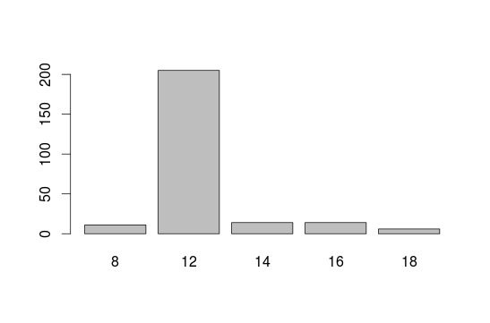
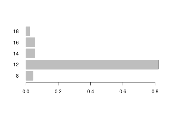
##Barplot with relative frequencys Relative frequencys show which percentage have some specific education. Just the y axis ist changing.
barplot(prop.table(educ))

barplot(prop.table(educ), horiz = T ,las=1)
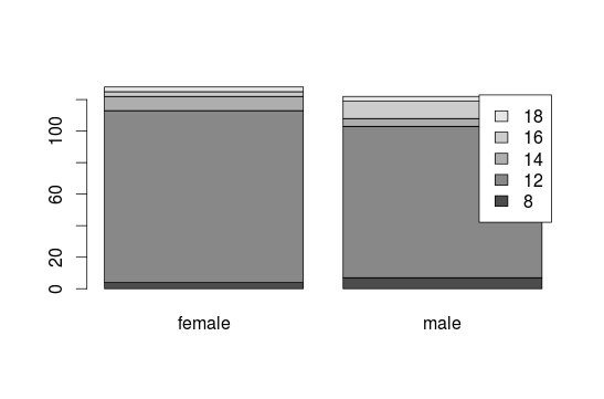
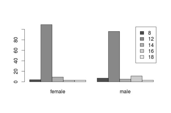
To connect two variables, here education and gender:
barplot(table(interest$educ, interest$gender), legend=T)
barplot(table(interest$educ, interest$gender), legend=T,beside=T)
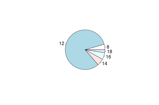
##Pie chart What is about some delicious pie?
pie(table(interest$educ))
#Graphs for metric variables
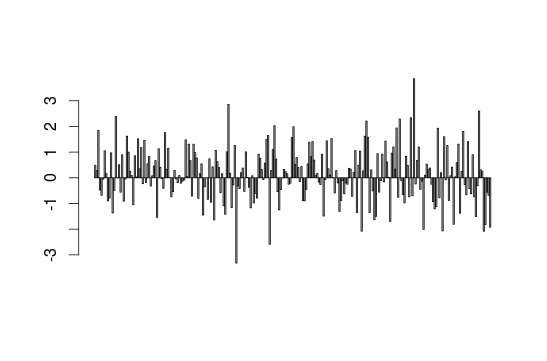
We build a barplot with the geometry variable:
barplot(interest$geometry)
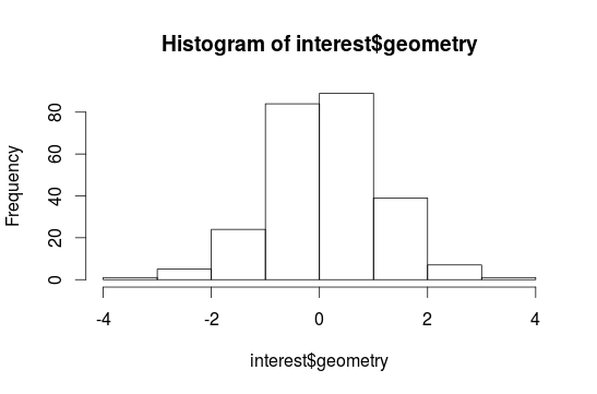
Now a histogram:
hist(interest$geometry)
Now a histogram with 10 breaks and a suggested normal distribution:
mean  <-  mean(interest$geometry, na.rm=T)
sd  <-  sd(interest$geometry, na.rm = T)
hist(interest$geometry, breaks=10)
curve(dnorm(x, mean, sd)*length(interest$geometry), add=T)
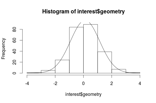
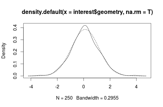
Sometimes it is difficult to interpretate a histogram, because it depends on the breaks. So we build a density plot with a continous line:
plot(density(interest$geometry, na.rm = T))
curve(dnorm(x, mean, sd), add=T, lty=2)
#Boxplots
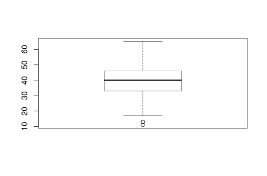
Boxplots are important for explorative data analysis and show characteristics of the distribution. Here we use the age:
boxplot(interest$age)
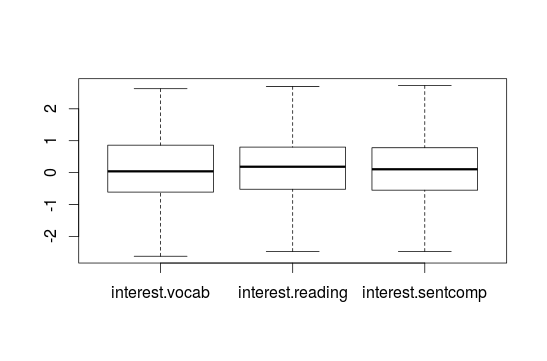
You can also create some Boxplots together:
boxplot(data.frame(interest$vocab, interest$reading, interest$sentcomp))
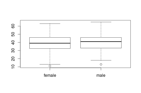
To show some Boxplots with informations about some groups (e.g. for women and men) you can use the ~ sign. With the identify() you can click on the Boxplots, for example to get to know extreme values.
boxplot(interest$age ~ interest$gender)
#identify(interest$gender, interest$age)
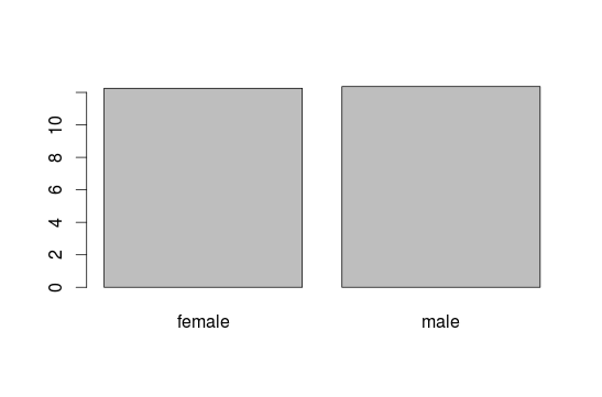
#Barplot for means We want to visualize the mean of education seperated for men and women. To do that we integrate the tapply() function in barplot():
barplot(tapply(interest$educ, interest$gender, mean, na.rm=T))
To integrate more means of variables we also use the tapply function:
barplot(tapply(interest$educ, data.frame(interest$gender, interest$age), mean, na.rm=T, na.omit=T), legend=T, xlab="age", ylab="education")
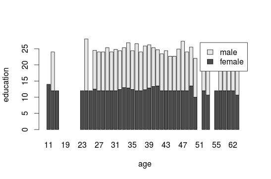
#for easier interpretations add: beside=TRUE
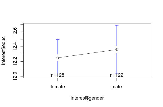
#Error bars To build an error bar, you can use the package gplots and the plotmeans() function. This function build confidence intervals and with p=0.95 we set it for the 95% confidence interval:
plotmeans(interest$educ~ interest$gender, p=0.95)
##Cats-eye plot
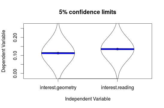
If you want to compare the confidence intervalss of some variables use the error.bars() function of the psych package. Here we compare geometry and reading:
geo.read <- na.omit(data.frame(interest$geometry, interest$reading))
error.bars(geo.read, within=F,alpha=0.95, eyes=T)
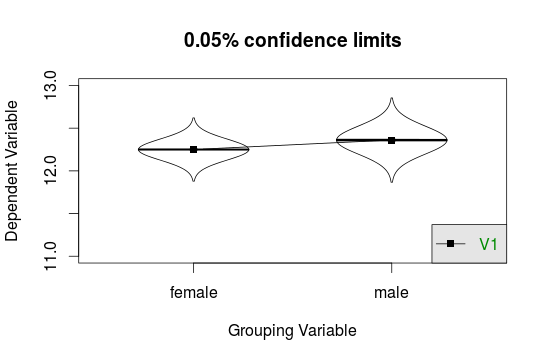
To compare means of several groups use the error.bars.by() function. But you have to build data.frames:
educ <- as.data.frame(na.omit(interest$educ))
gender  <- as.data.frame(na.omit(interest$gender))
error.bars.by(educ, gender, by.var=T, ylim=c(11,13), legend=1, eyes=T, alpha=0.95)
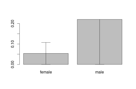
##Create own Error bars To create your own error bars use the arrow() function and build arrows around the means of the barplot with a distance of the standard deviation. We do this for the first block in the barplot:
des.read  <-  describeBy(interest$reading,interest$gender, mat=T)
plot.read  <- barplot(des.read$mean, names.arg = des.read$group1)
arrows(plot.read[1], des.read$mean[1]-des.read$mean[1], plot.read[1], des.read$mean[1]+des.read$mean[1], code=3, angle=90)

To do this for the second or maybe more blocks in the barplot define the i in the following command. It allows you to get all columns in the table of des.read:
plot.read  <- barplot(des.read$mean, names.arg = des.read$group1)
for(i in 1:nrow(des.read)){
  arrows(plot.read[i], des.read$mean[i]-des.read$mean[i],
         plot.read[i], des.read$mean[i]+des.read$mean[i],
         code=3, angle=90)
}
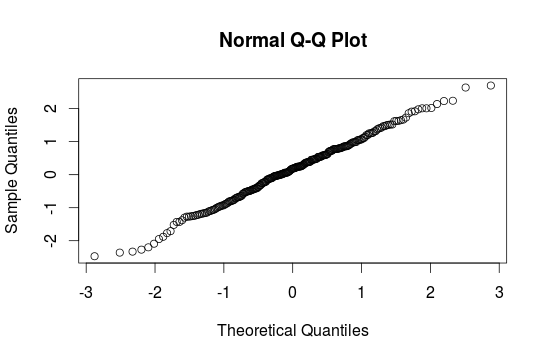
#Q-Q-Plot When we are interested in a normal distribution histograms can`t help us much. Better are qqplots. The nearer the points are at the line the better is the normal distribution. qqnorm() is in the car package:
qqnorm(interest$reading)
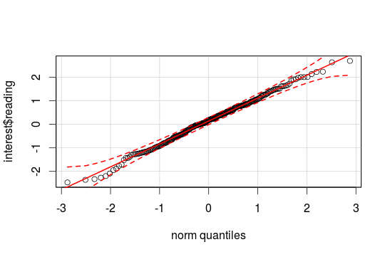
qqPlot() is in the car package and shows you the confidence interval. If the point lays near the interval it is normal distributed:
qqPlot(interest$reading)
#Scatterplot To get the connection between two variables use scatterplots with two vectors:
plot(interest$reading, interest$geometry)

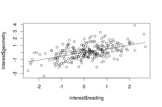
##Adding a Lowess-curve A Lowess curve is a nonparametric curve that rebuilds the connection between two variables, but we need varaibles without missing values:
read.geo <- na.omit(data.frame(interest$reading, interest$geometry))
plot(interest$reading, interest$geometry)
lines(lowess(read.geo[,1],read.geo[,2]))
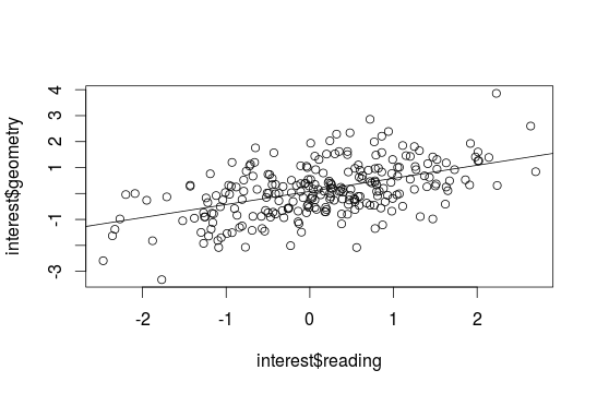
##Adding a regression line To get a regression line use the abline() function combinated with a lm(). With identify() you can again search for extreme values:
plot(interest$reading, interest$geometry)
abline(lm(interest$reading~interest$geometry))
#Edit graphs To change the standard setting use the par() function to visit the possibilities for changing something:
par()
help(par)
- pch=x - type of points in a scatterplot
- ces=x - size of points or lettering
- lty=x - type of line
- lwd=x - size of the line
- las=1 - numbers on the y axis are shown horizontal
- xlab=”x”, ylab=”x”- the names for the axes
- xlim=c(min, max), ylim=c(min,max)- the scale of the axes
- main=”text” - heading
- sub=”text” - subheading
- col=x - the color (colors() gives a full list)
#Adding elements
To add something, write it directly under the plot() function, than it will be added to this graph:
- abline() - straight line
- arrows() - arrows
- axis() - lettering axes
- curve(….,add=TRUE) - functioncurves
- legend() - legend
- lines() - lines
- points() - points
- symbols() - symbols
- text() - text
To get more informations use the help(abline) function.